Redesigning the most-used mobile feature in the platform - from a source of daily frustration into a tool people actually trust
Role
Lead Product Designer
Timeline
2025
Status
Released
The Problem
How do we make a data‑heavy report feel immediate, trustworthy, and effortless on a 6-inch screen, without sacrificing the depth that power users depend on?
Four small failures. One broken experience.
01
No sign the data was fresh
No last-updated time, so affiliates could not trust what they saw.
ObservedTapping "Update" again and again
02
Filters out of reach
Controls sat at the top, far from where thumbs live.
ObservedLow filter use on mobile vs. desktop
03
A table that did not fit
Desktop-wide columns forced horizontal scrolling.
ObservedLosing context and giving up mid-row
04
No entry point for lookup
Searching a customer ID was buried in the flow.
ObservedMultiple steps for a quick lookup
The Solutions
Built into the behavior, not the screen.
The best UX decisions are invisible. You feel them. Here is what we built into the behavior.
01 · Trust
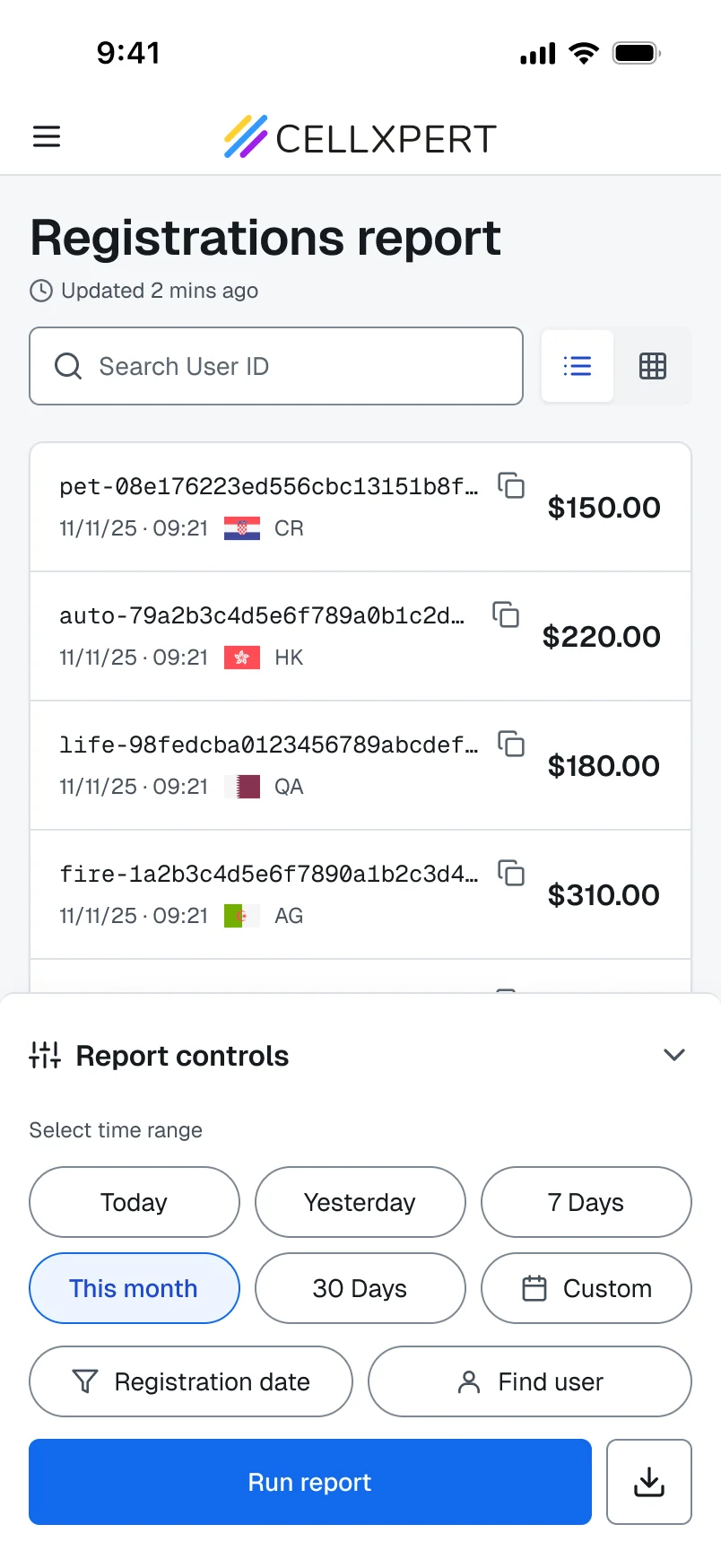
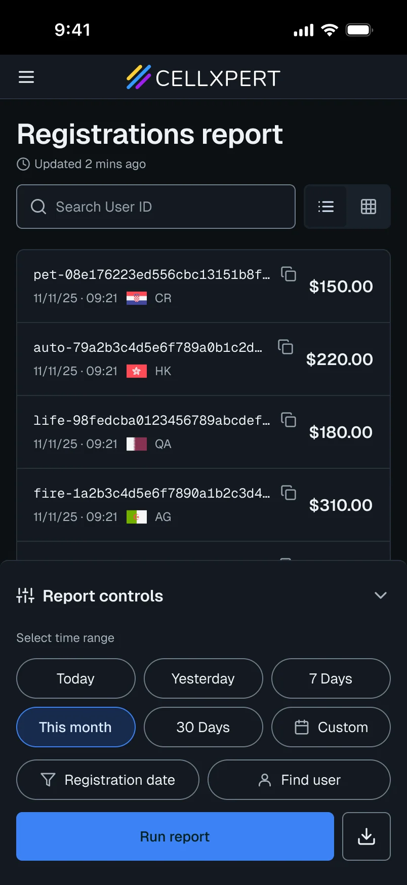
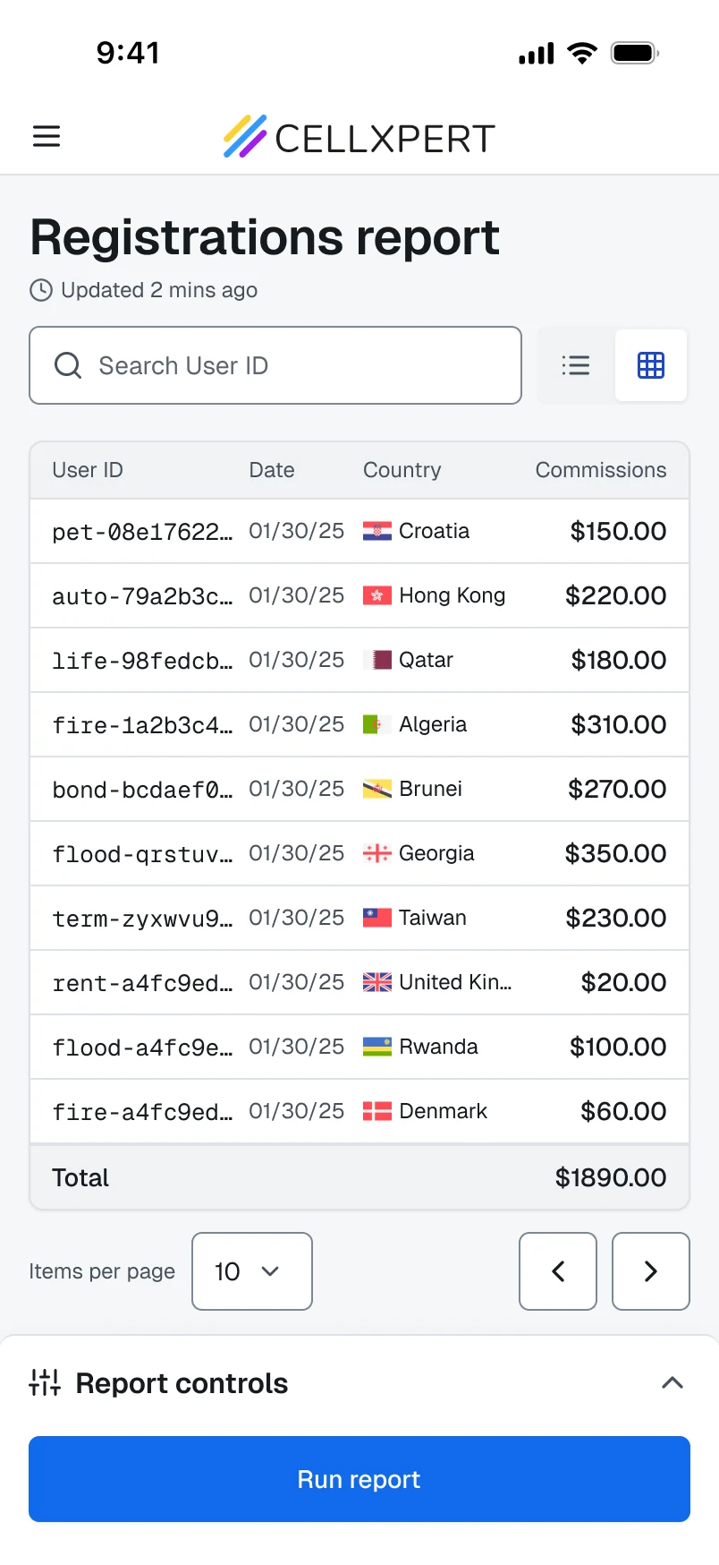
A timestamp you can trust.
Affiliates kept tapping Update because they could not tell how old the data was. Now the header always says.
DecisionRelative time ("2 mins ago"), not 09:14. It answers "is this fresh?" with no math.
02 · Intent
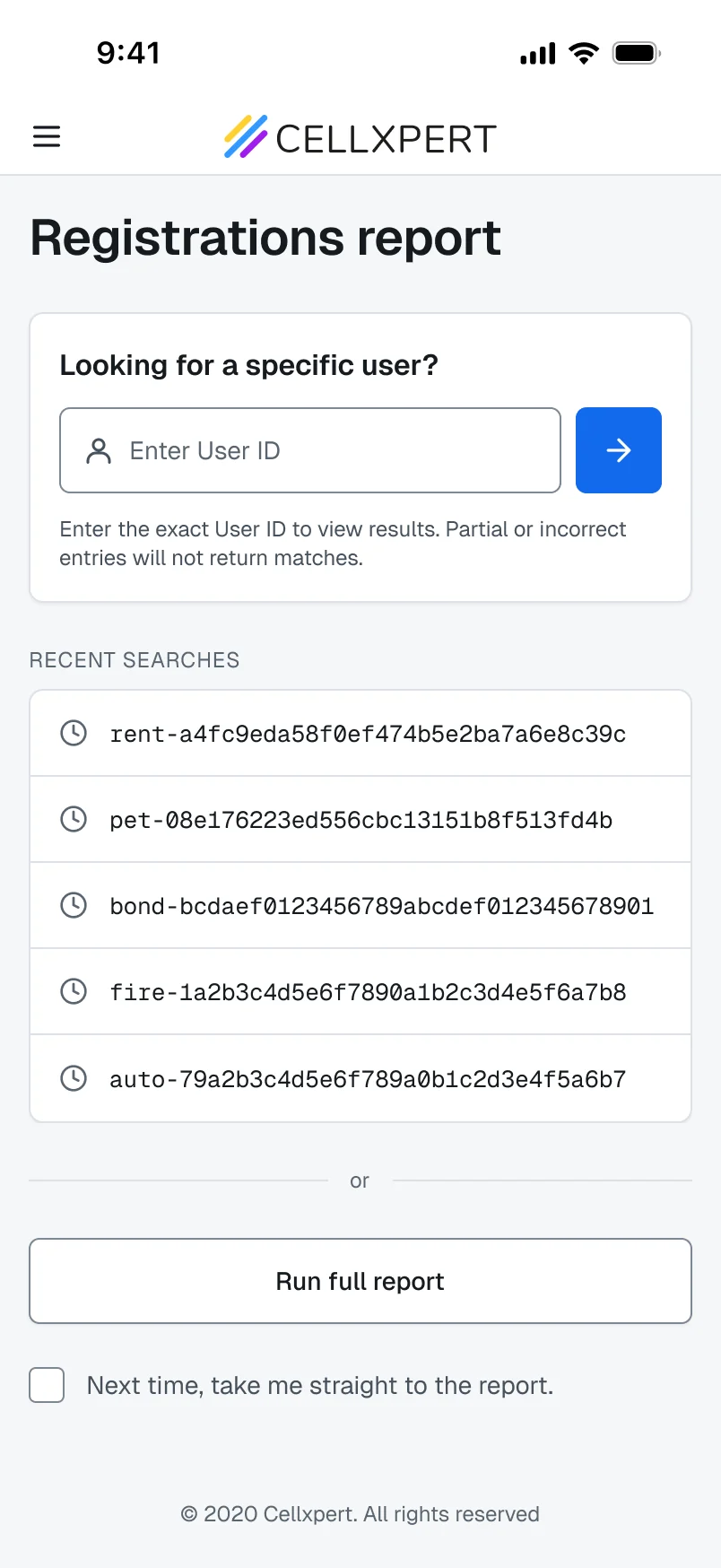
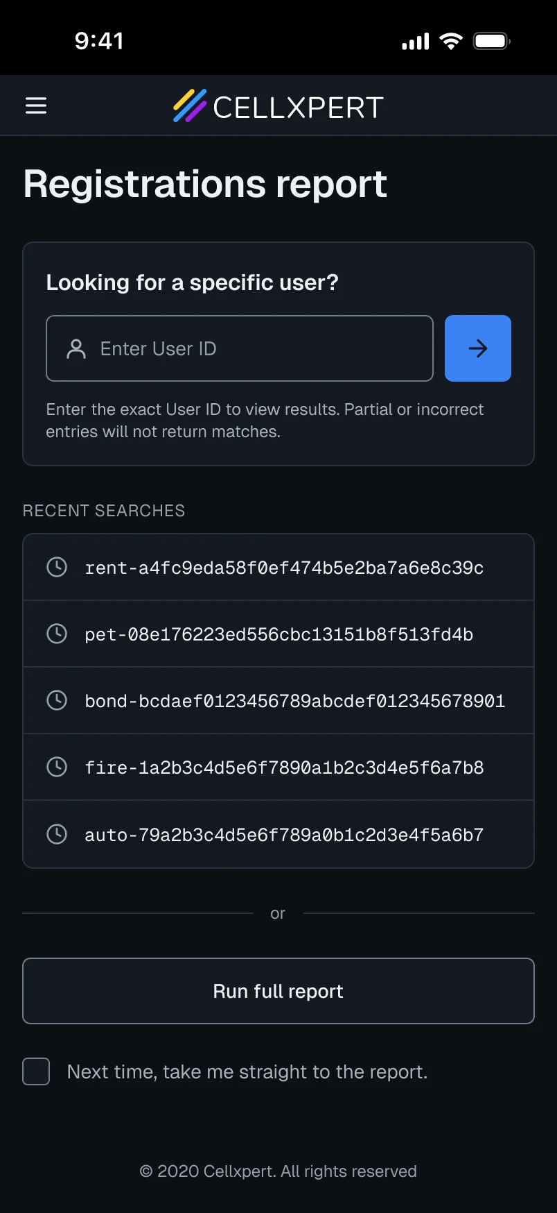
Search first.
Many affiliates arrive with a customer ID already in mind. The flow now starts at the record, not the report.
DecisionA "skip this page next time" toggle keeps regulars fast.
Detail · Recent searches
Your last lookups, one tap away.
The same IDs get checked again and again. Recent searches skip the retyping.
03 · Reach
Filters moved to the thumb.
A bottom drawer you can reach without shifting grip. The report stays visible behind it.
DecisionCollapsed by default, with a count badge when filters are active.
04 · Depth
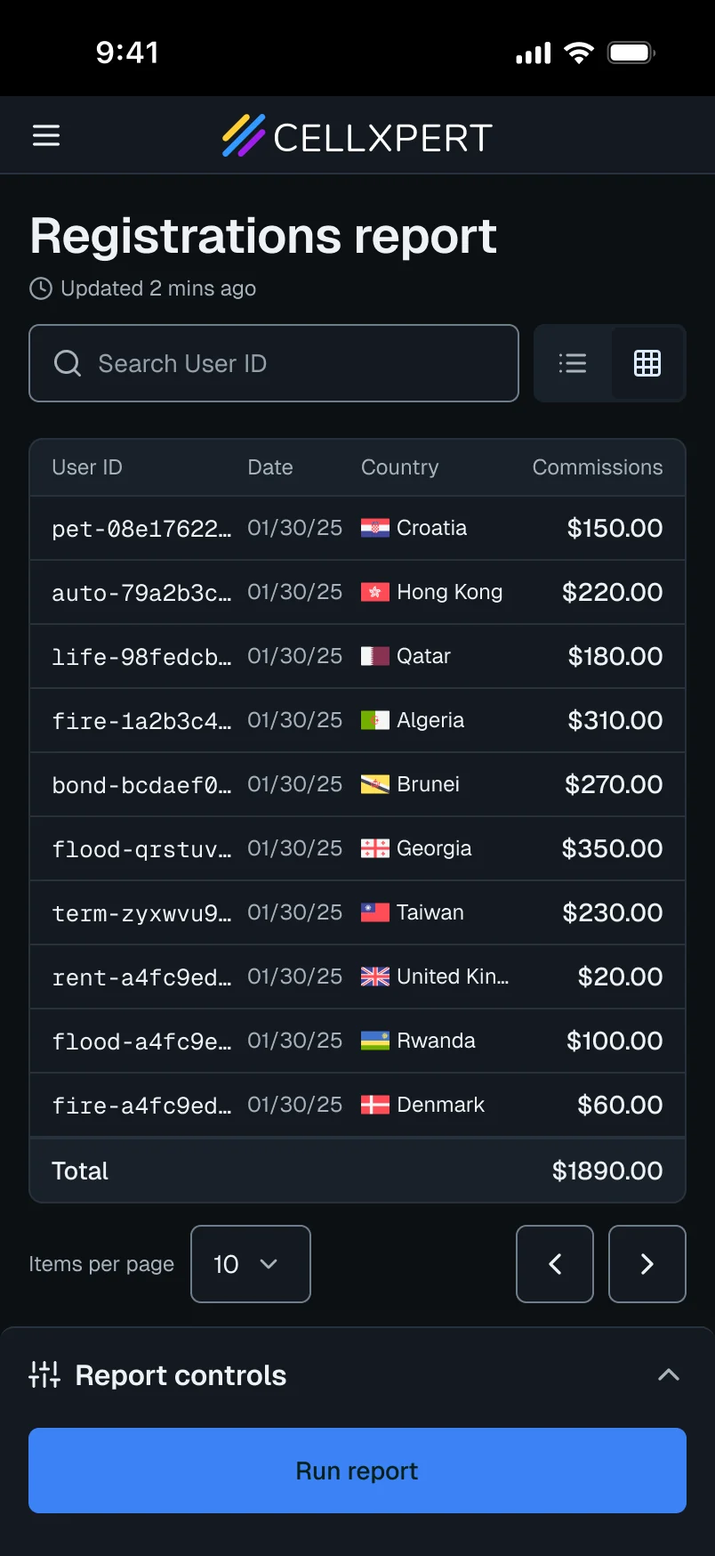
Four columns. Nothing lost.
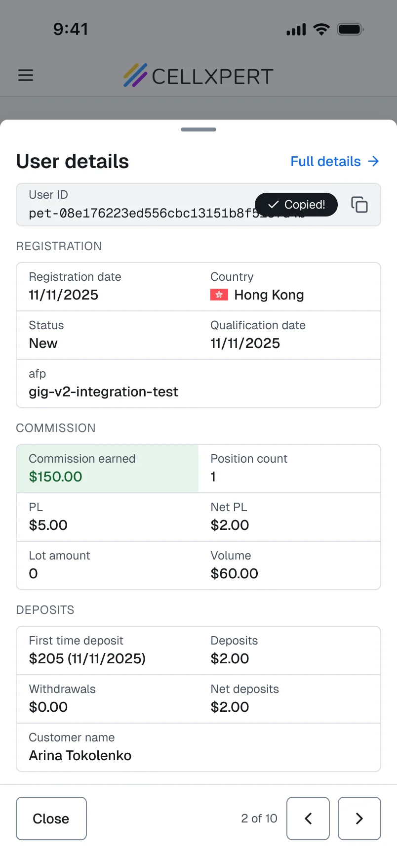
The table keeps only what you need to scan and identify. Tap any row for the rest.
DecisionDepth on demand: the rest is one tap away, never removed.
Detail · Copy on tap
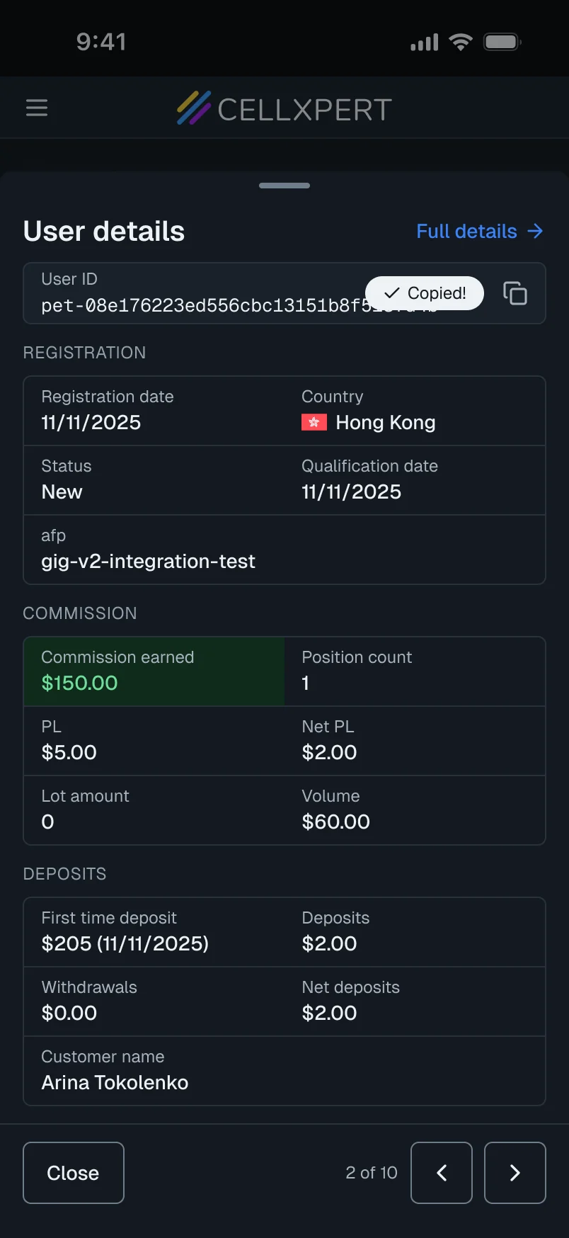
Tap any field to copy it.
IDs and emails end up in sheets and CRMs. A brief toast confirms the copy.
Detail · Row navigation
Step through rows.
Arrows inside the modal move through registrations without going back to the list.
Scroll to turn the phone
01 / 07
The Approach
Constraints we worked within. Decisions we made.
Before touching a screen, we agreed on what we could change, what we could not, and the rules that would guide every call.
Constraints
Fixed data model
The columns stayed. We rethought how they were shown.
Shared design system
New patterns had to fit it, or become reusable.
Limited engineering time
Highest UX impact for the least effort. No rebuilds.
Principles we designed by
1
Thumb-first, always
Every primary action reachable with one thumb.
2
Trust before data
Show that it is current before showing a number.
3
Depth on demand
Hide the extra, never remove it.
4
Respect the intent
Meet users at their goal, not at zero.
Considered, not pursued
Persistent filter bar
Ate screen space. Replaced by an on-demand drawer.
Horizontal card swipe
Hid the list context. Users could drill, not scan.
Forced quick search
Frustrates users without an ID. Made it skippable.
Impact
Every problem we named, we measured.
Each number maps to a problem from the start of this project.
−72%
Trust problem solved
Rage clicks on Update
The timestamp gave the reassurance they kept refreshing for.
−55%
Trust problem solved
Missing-registration tickets
Most were doubts about freshness, not missing data.
+20%
Reach problem solved
Mobile filter and date range usage
Controls in thumb range. The need was always there.
Unexpected finding
4 in 10 sessions start with an ID.
We had no data on how many affiliates arrive with a customer ID. The quick-search entry let us measure it for the first time.
Nearly all of them used it, so it is a real accelerator. It now shapes entry points in other reports.
40%
of sessions
arrive with a specific ID
95%
of those users used quick search or recent searches
Next project
Cellxpert
Admin platform
A full platform rebuild around one question: what am I actually looking at?