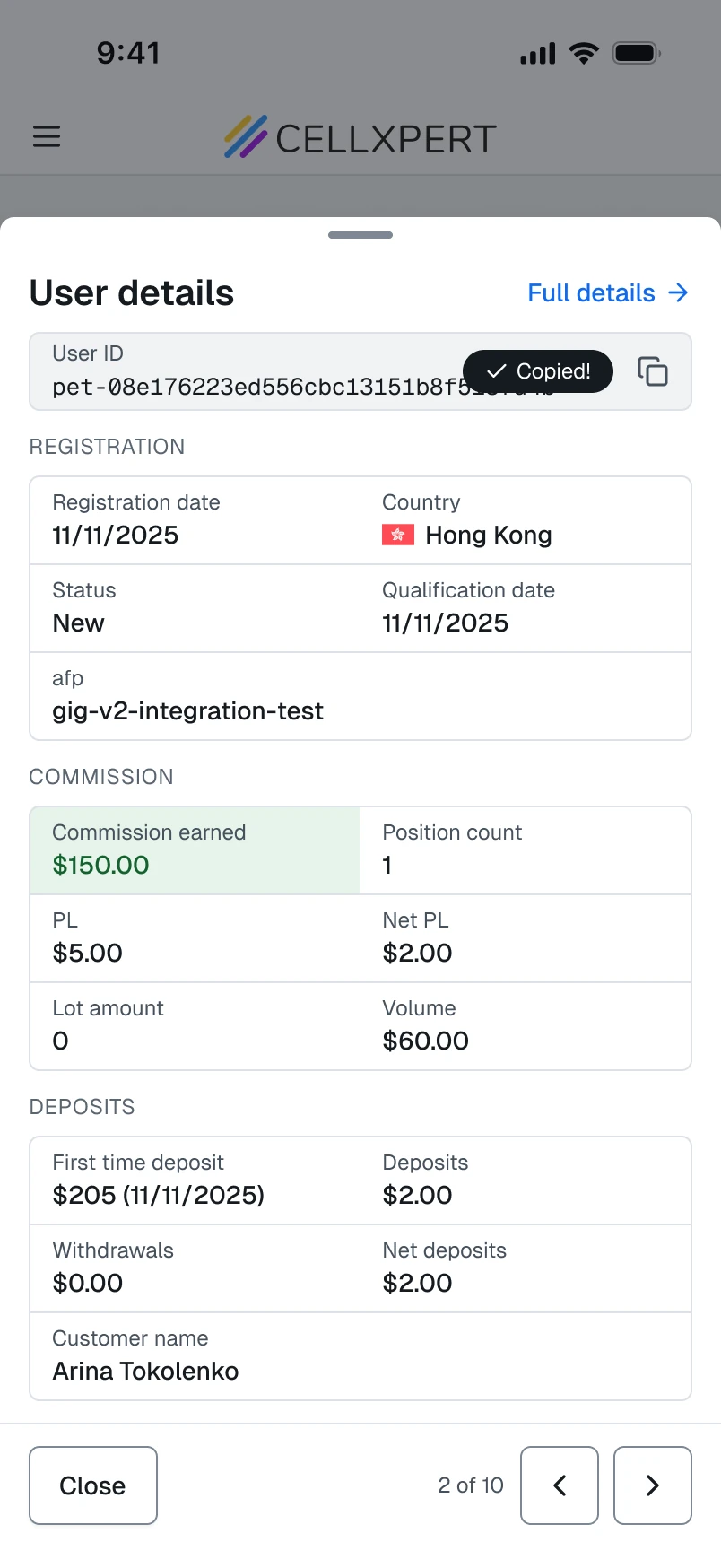
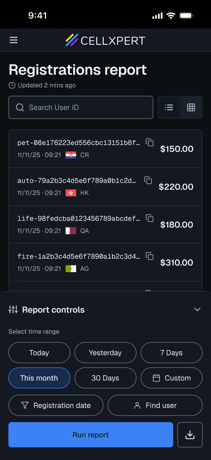
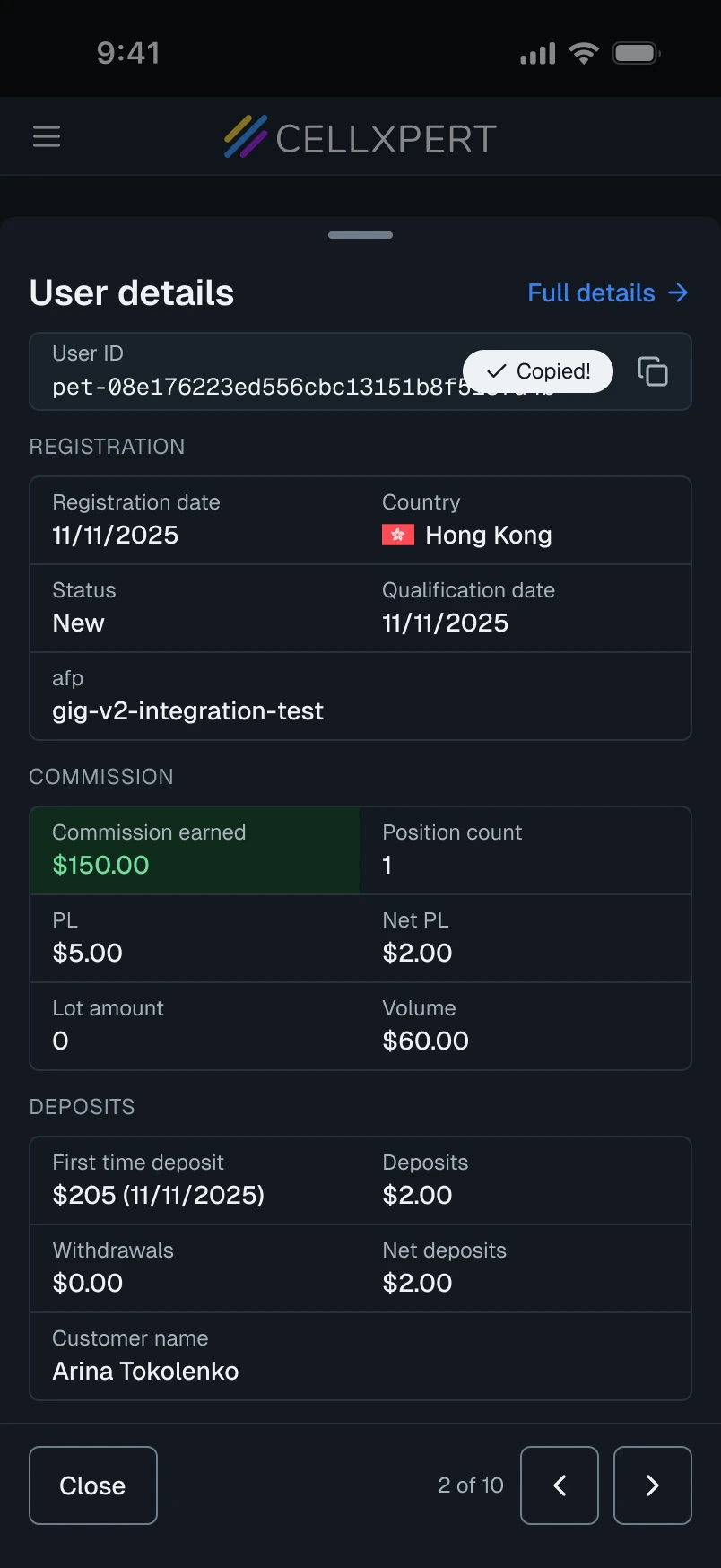
Redesigning the commission builder - the most sensitive, most critical, and most broken feature on the platform.
Role
Lead Product DesignerProject Manager
Timeline
2024-Present
Status
Recently Released
BeforeAfter
The Problem
The most sensitive data on the platform, on the hardest screen to read.
“I can never tell what they're actually on without clicking through everything.”
Y.C., Affiliate Manager
01
No full picture
One plan type visible at a time, navigated by slides.
02
No comparison
A brand dropdown replaced the whole screen.
03
Always editable
Even reading felt risky.
04
Wrong job
Built for changing. Used for checking.
Before
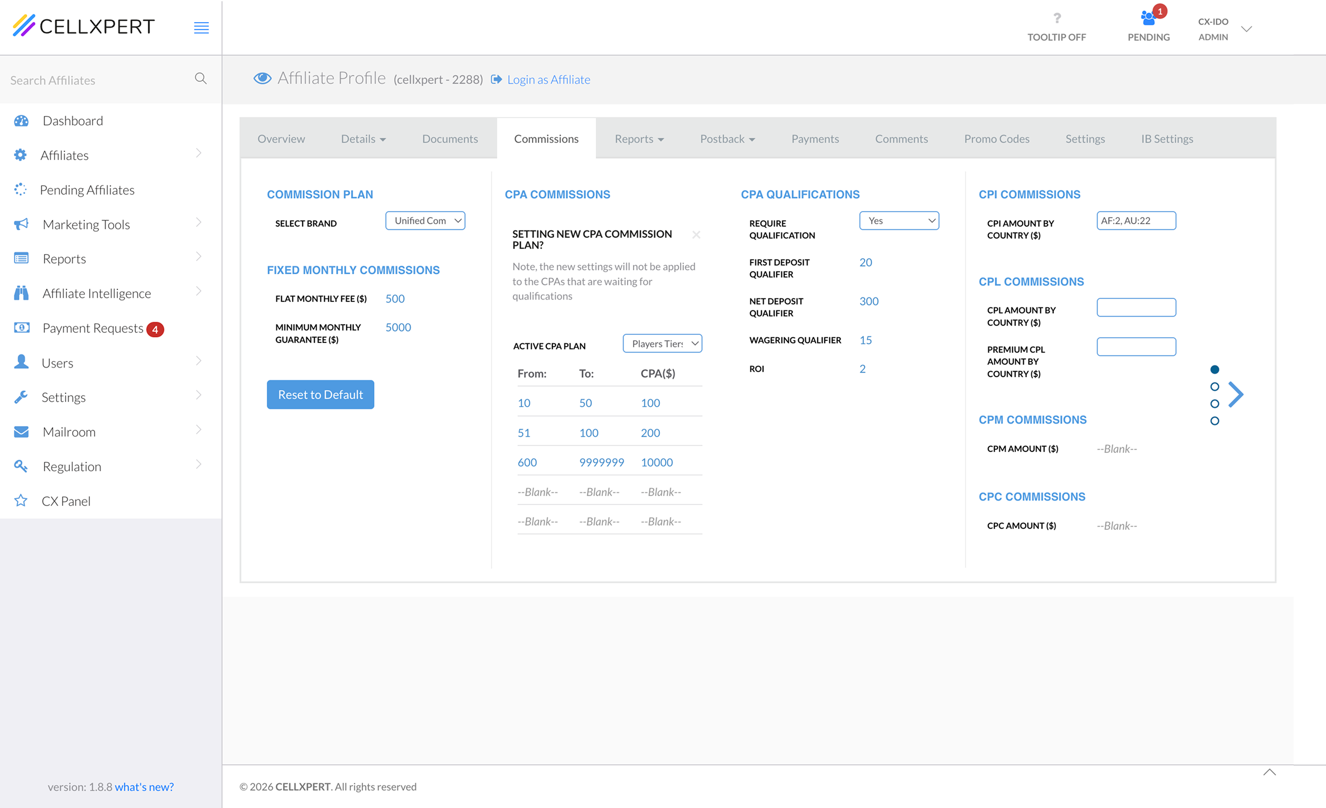
What it looked like. What it felt like.
1
Brand switch wipes the screenComparing brands relies on memory.
2
Always editableReading and editing look identical, so every click feels risky.
3
No on/off stateAll options show, but you can’t tell which are active.
4
One type at a timeNo overview of the full plan.
The Insight
Designed for editing. The job was understanding.
What the old UI assumed
Admins open commissions to edit.
What the research showed
Admins open commissions to check: before a call, a report, a decision.
The Constraint
The data model and backend logic stayed as they were. Every improvement had to live in the interface.
Trade offs
A decision that went another way.
Context
Every field saved the moment you finished with it. For admins changing real payouts, that felt unsafe: there was no moment to review before changes counted.
Options
A. Save changes button
Review, then commit once.
B. Save per field
Chosen
Keep the current behavior.
My assessment
A. Save button
B. Per field
Trust for the admin
High
Medium
Backend impact
Large rework
None
Risk and cost
High
Low
Decision
The CEO and VP Product decided to keep per-field saving. Moving to a Save button meant changing how commissions are run and calculated, which was too risky and costly for this release.
Consequences
I designed around it
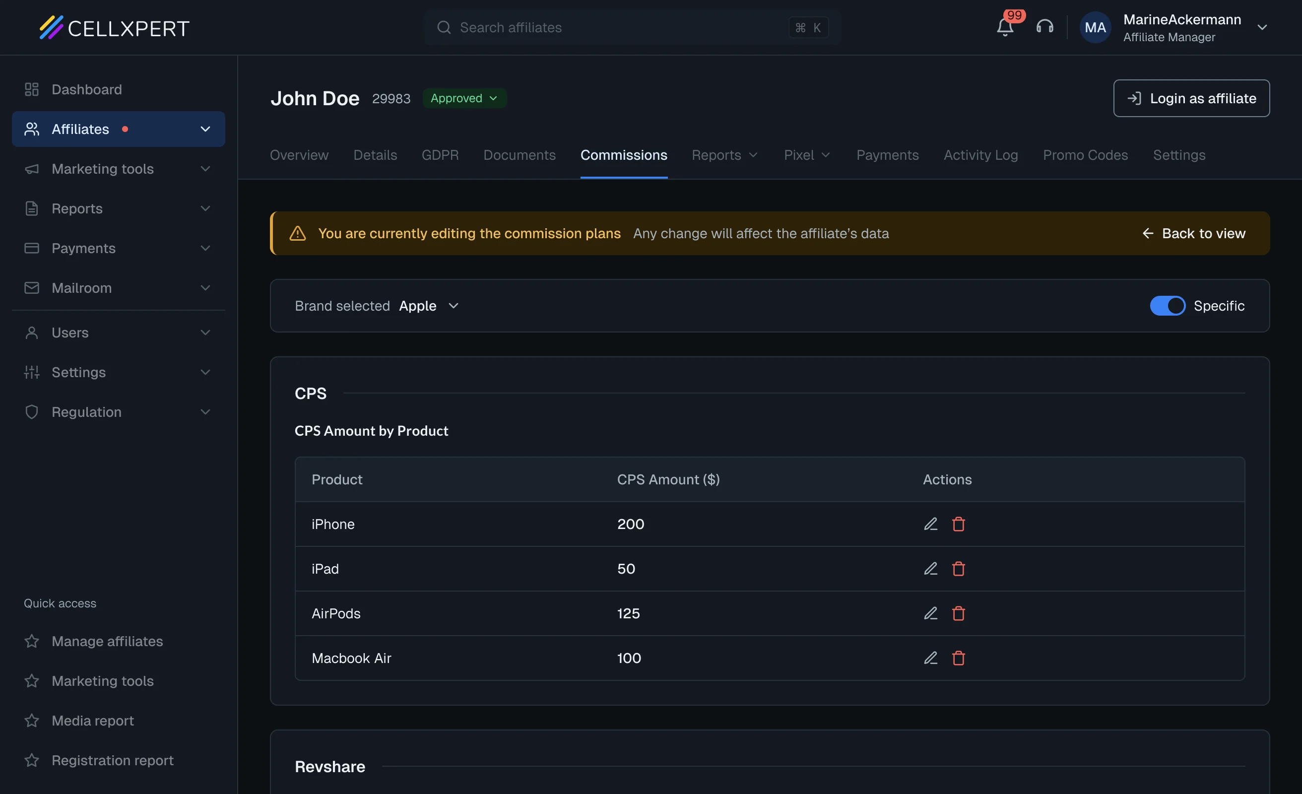
Configuration mode, a persistent warning banner, disabled navigation, and a confirmation after every field.
Cost I accepted
No single review step before changes take effect.
Revisit
Once the feature is live, I’d track two signals: edits corrected right after saving, and support tickets about wrong commission changes. If they stay high, I’d first try a lighter safeguard that doesn’t touch calculation, like a short summary of what changed when leaving configuration mode. A full Save step comes only if that isn’t enough.
Solution - Mode 1
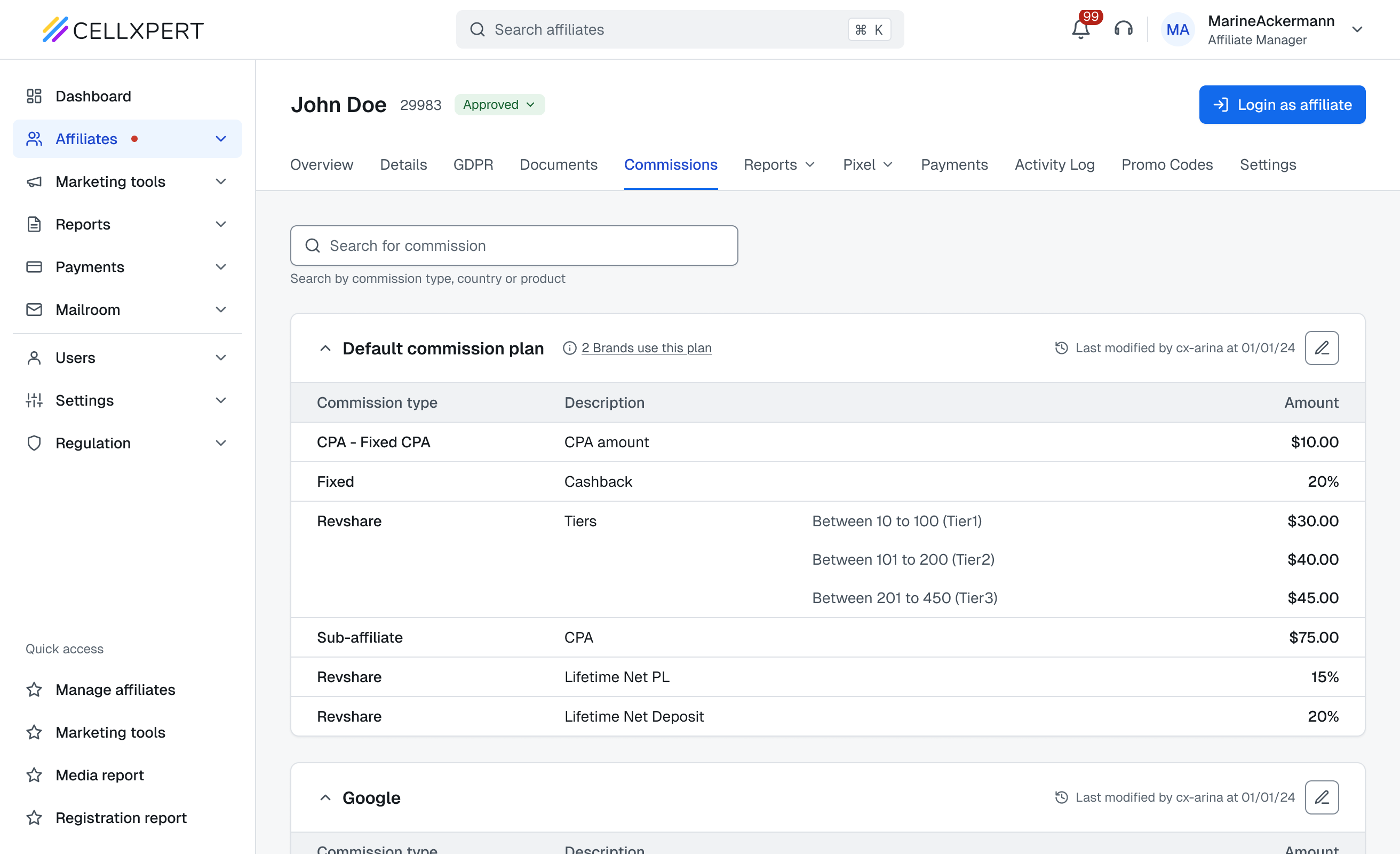
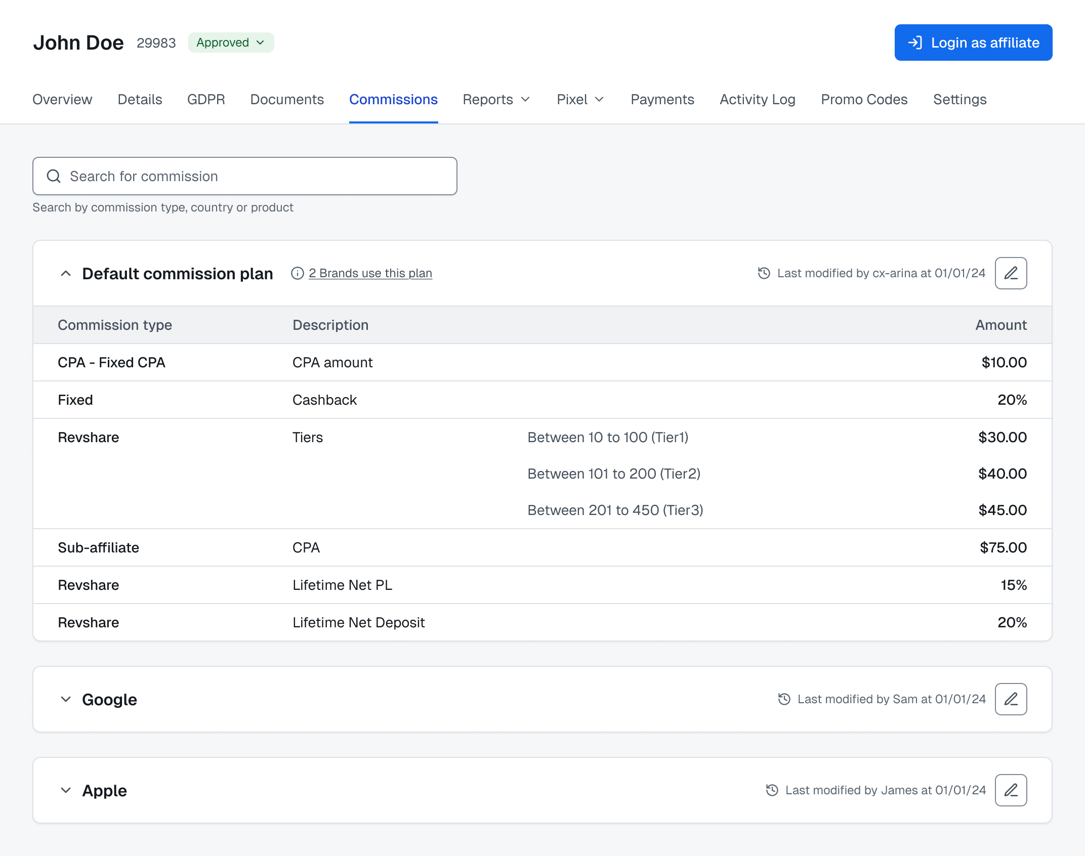
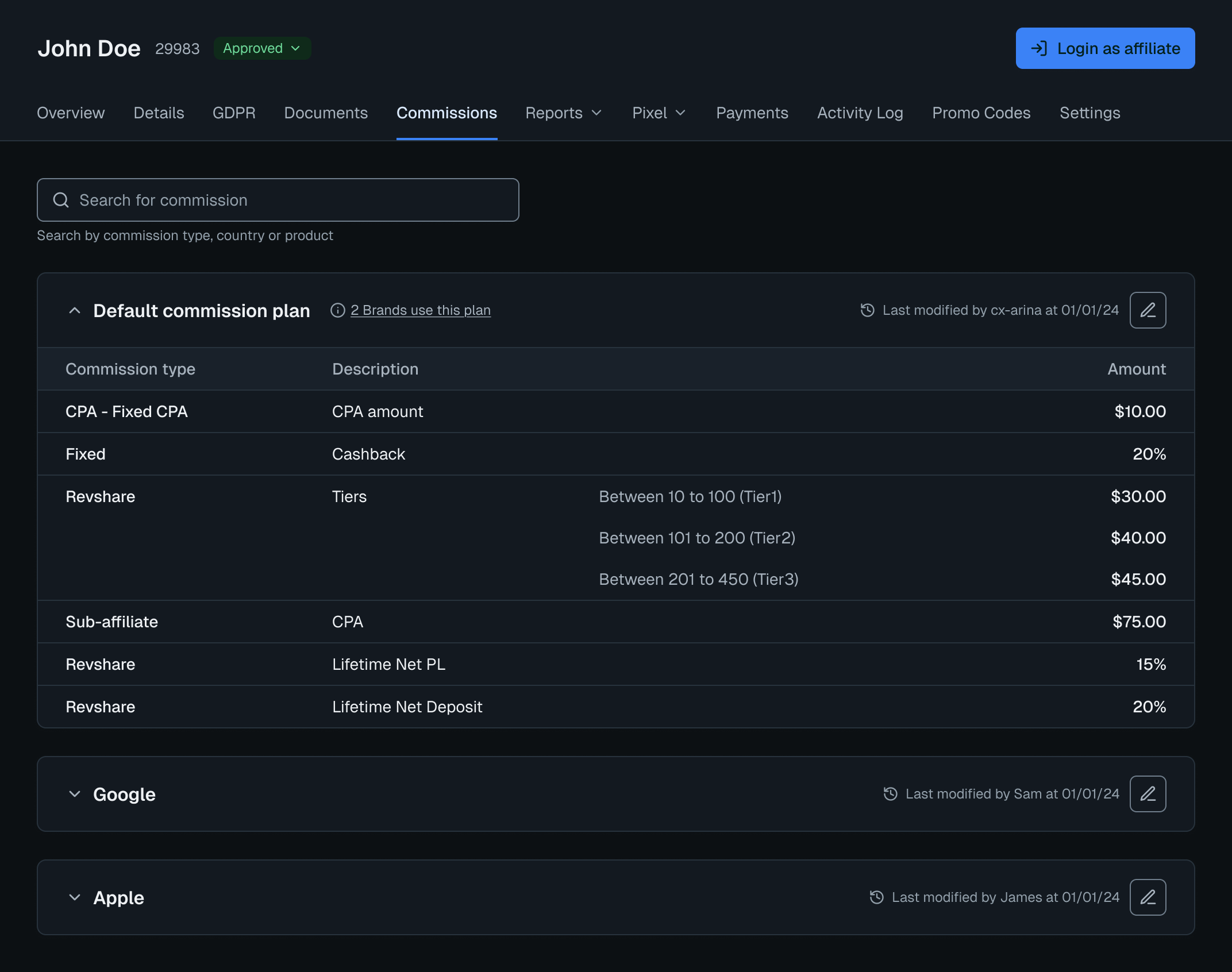
View mode. Read it in seconds.
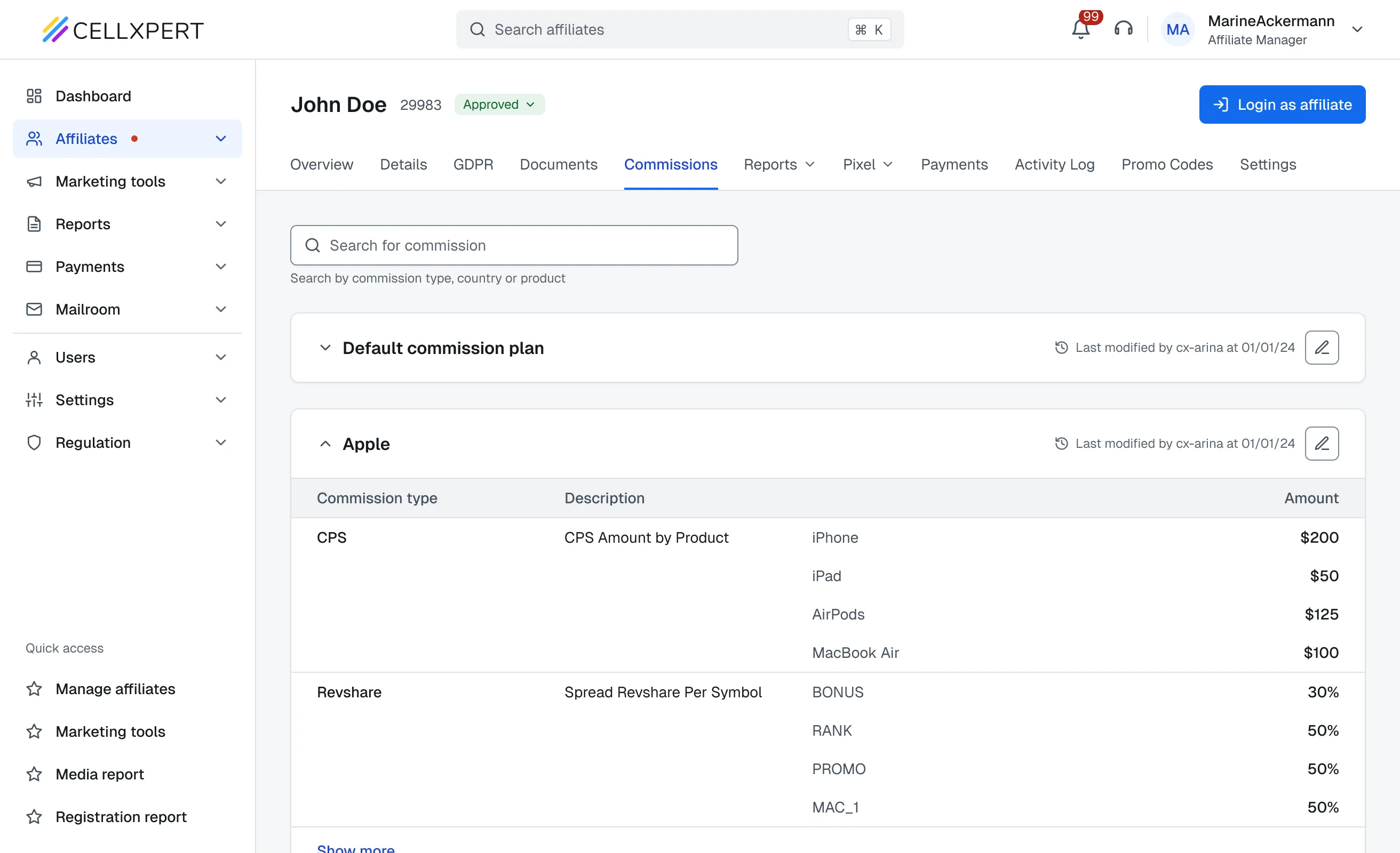
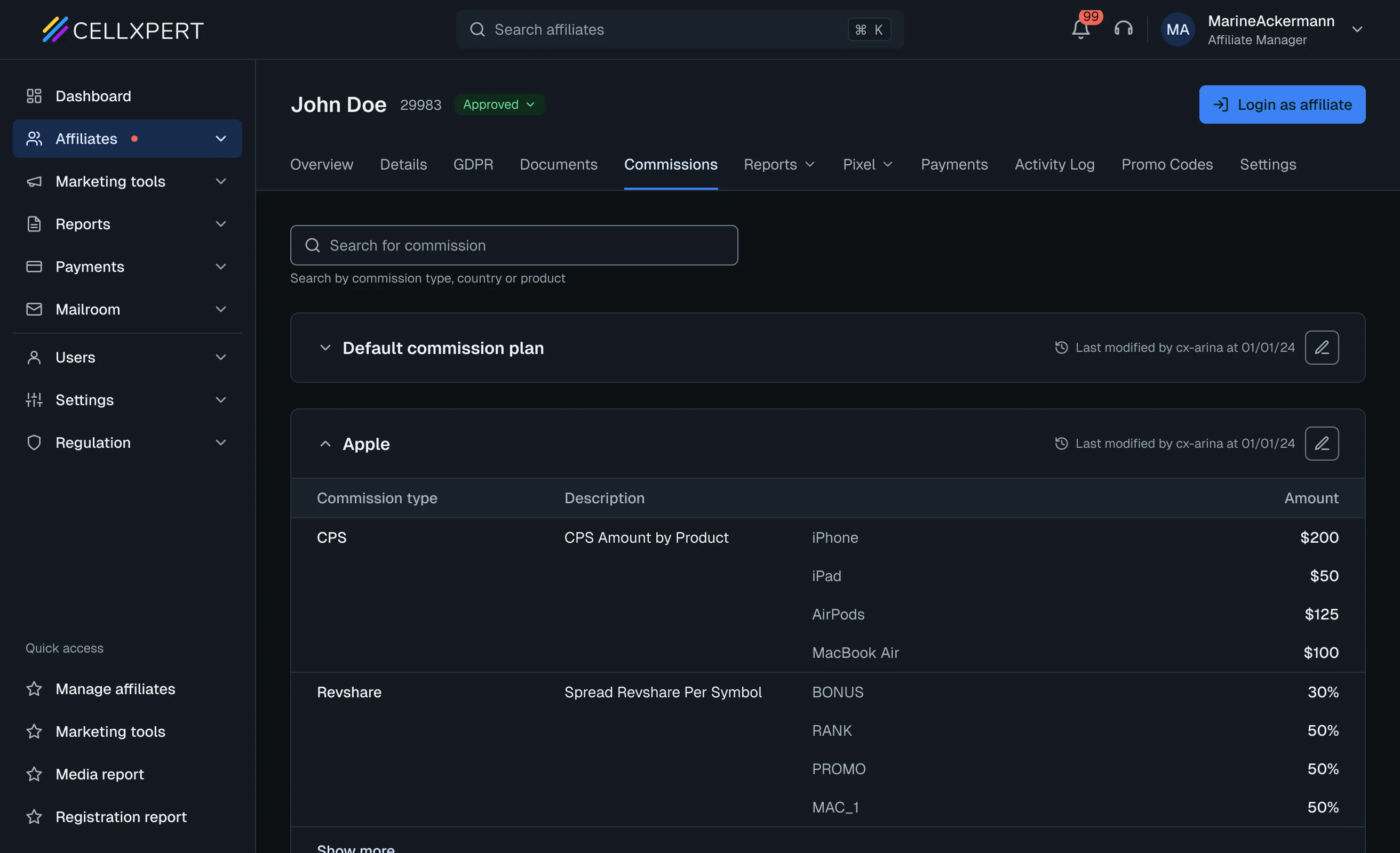
The default state. Built for comprehension, so nothing here can be changed by accident.
1
Accordion by brandAll brands in view at once, no screen swap.
2
One table, commissions as sub-rowsThe whole plan in a single view.
3
Metadata that builds confidenceWho last changed it, and how many brands it touches.
4
Edit behind a deliberate actionRead-only by default. One quiet icon leads to editing.
Solution - Mode 2
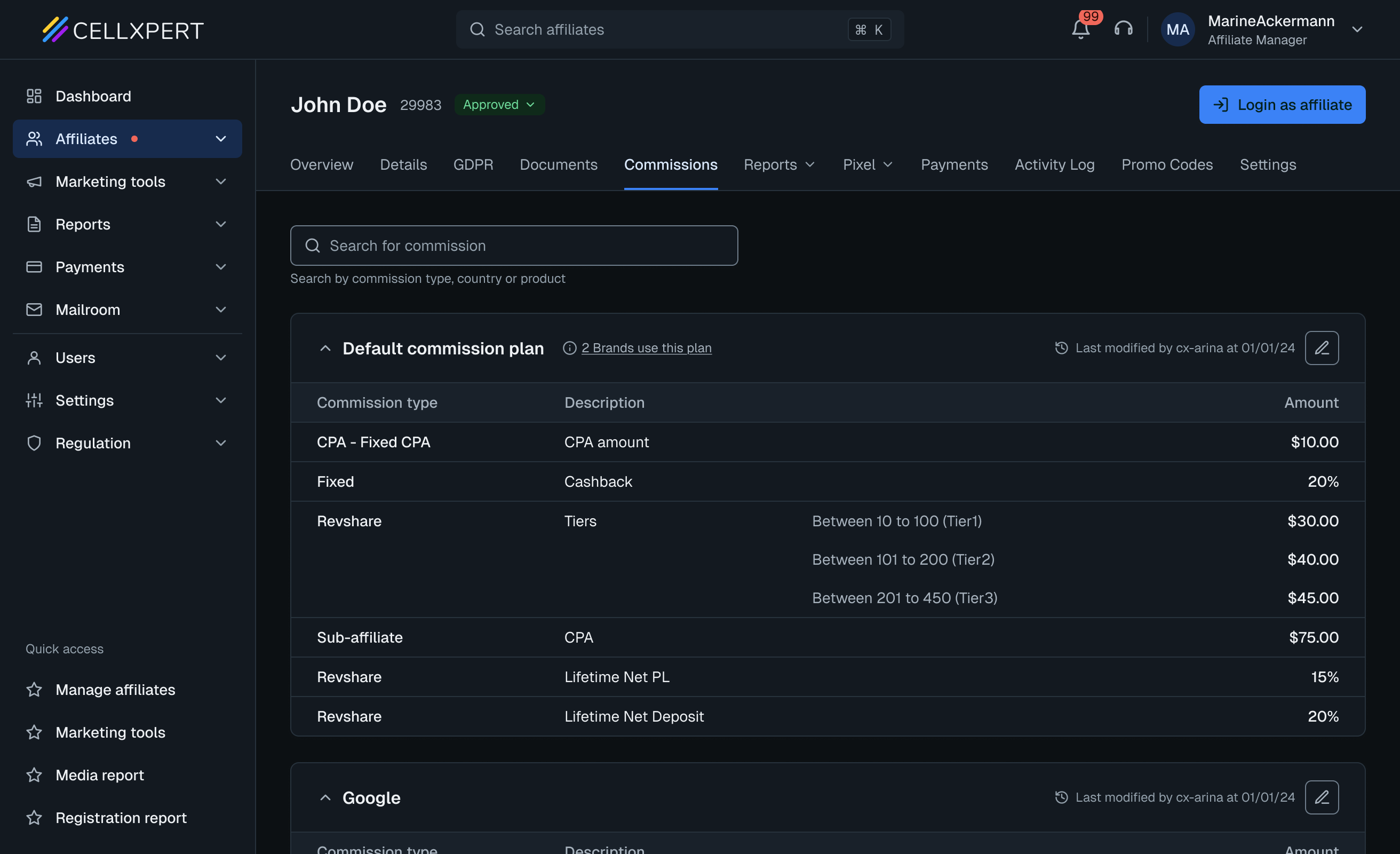
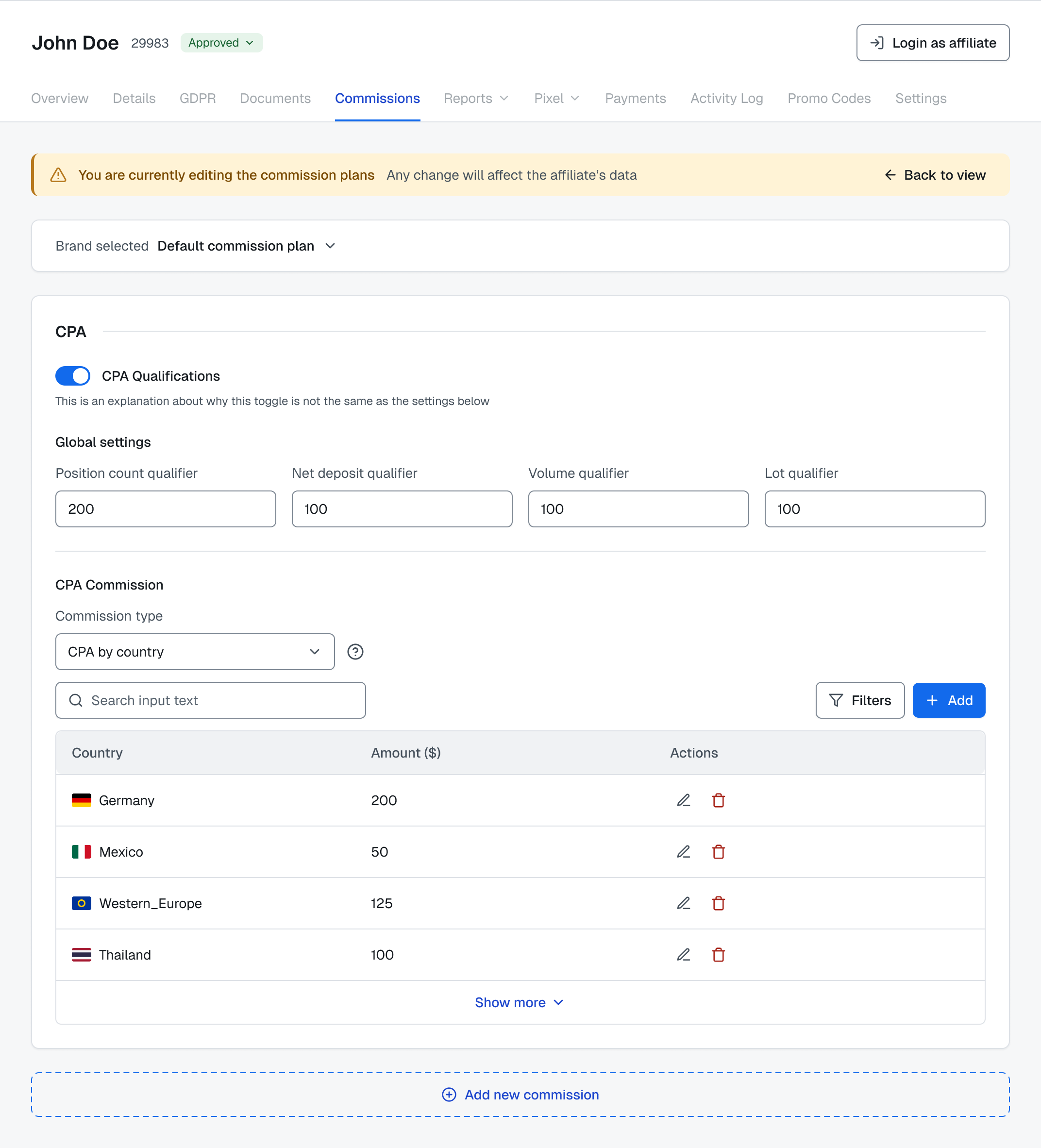
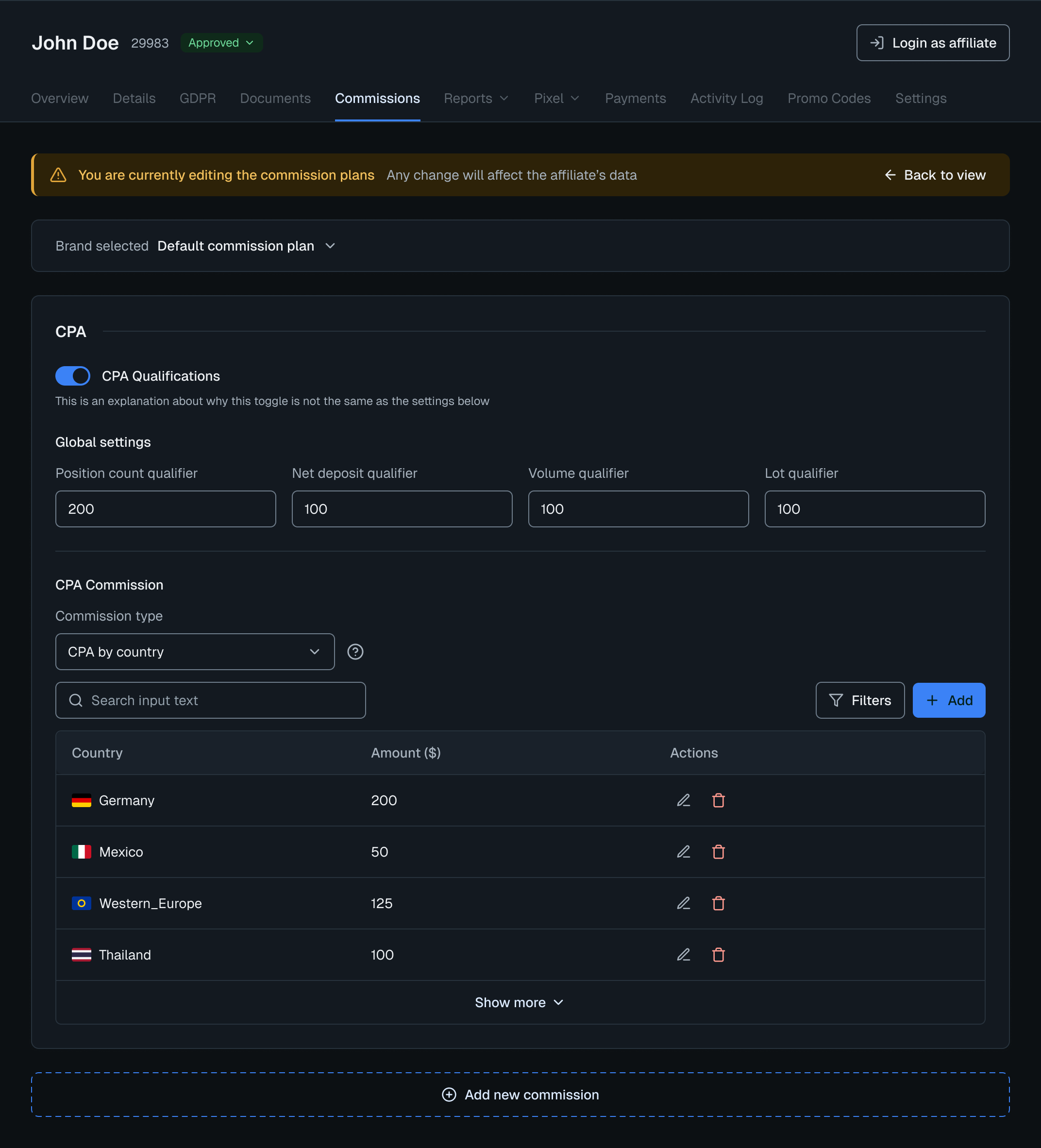
Configuration mode. You’re here on purpose.
The interface narrows its focus to signal that what happens here has real consequences.
1
Everything else is disabledFocus works as a safety measure.
2
A persistent warning bannerThe stakes stay visible all session.
3
One form, 40+ plan typesIt adapts its fields to the type you pick.
4
Every change confirmedAn inline notification after each field.
In Practice
The flow in action. Setting up a brand-specific plan.
Breaking a brand away from the default plan is one of the highest-stakes actions an admin can take. It starts with one decision modal that branches into three paths. Below is “start from scratch”, the most complex path and the one that shows the full range of plan types.
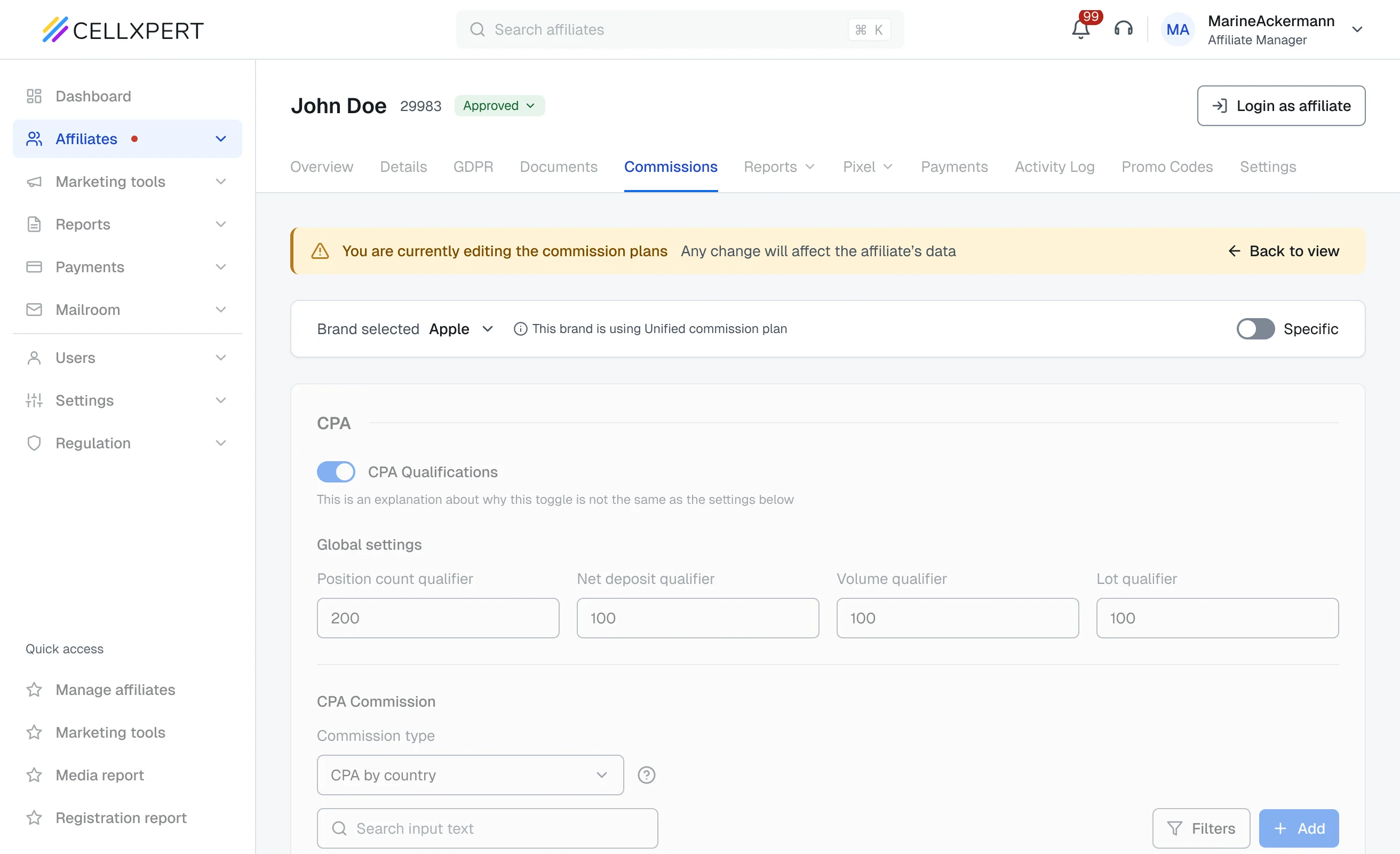
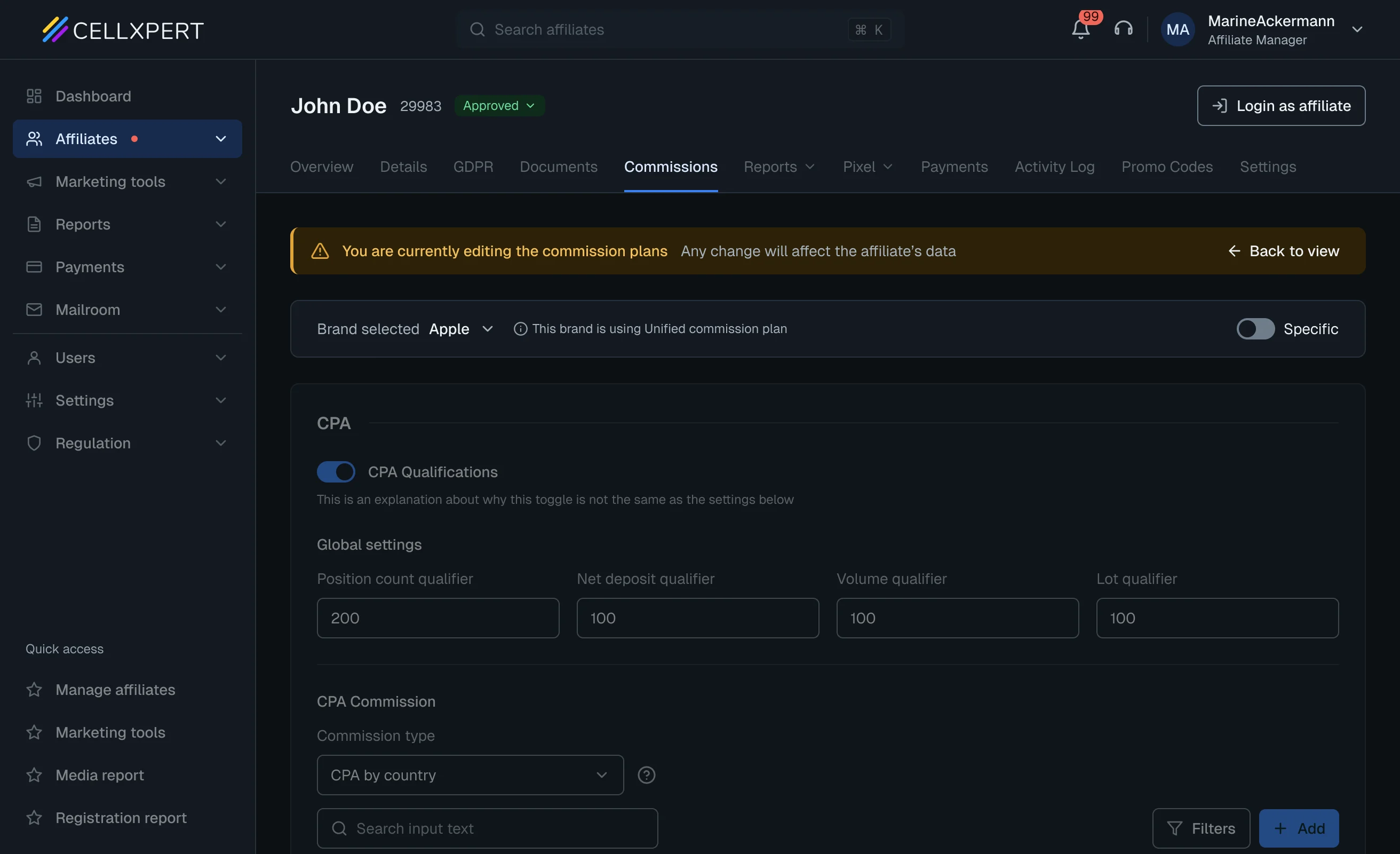
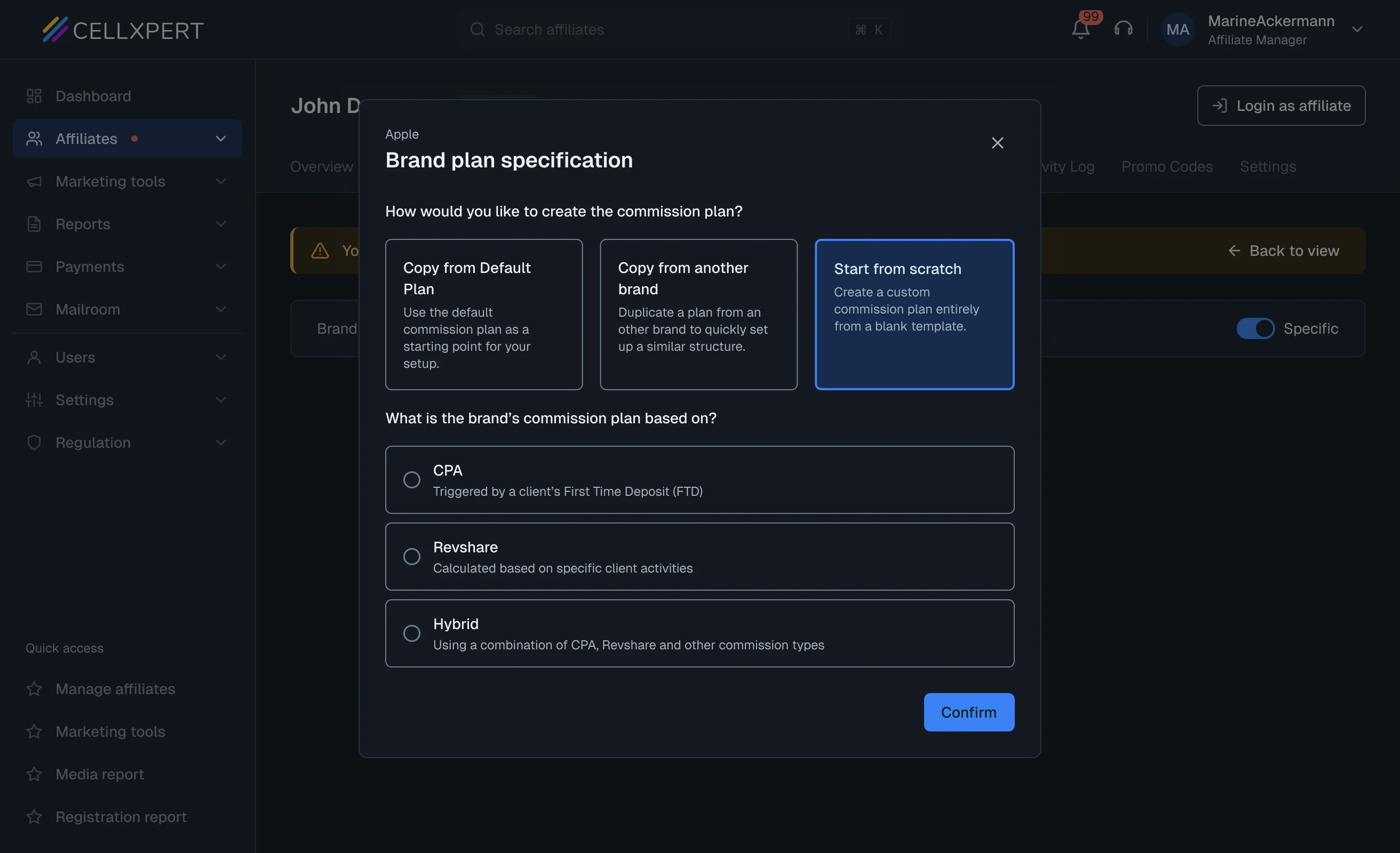
Break away from the defaultThe brand follows the unified plan. Flip Specific to give it its own.
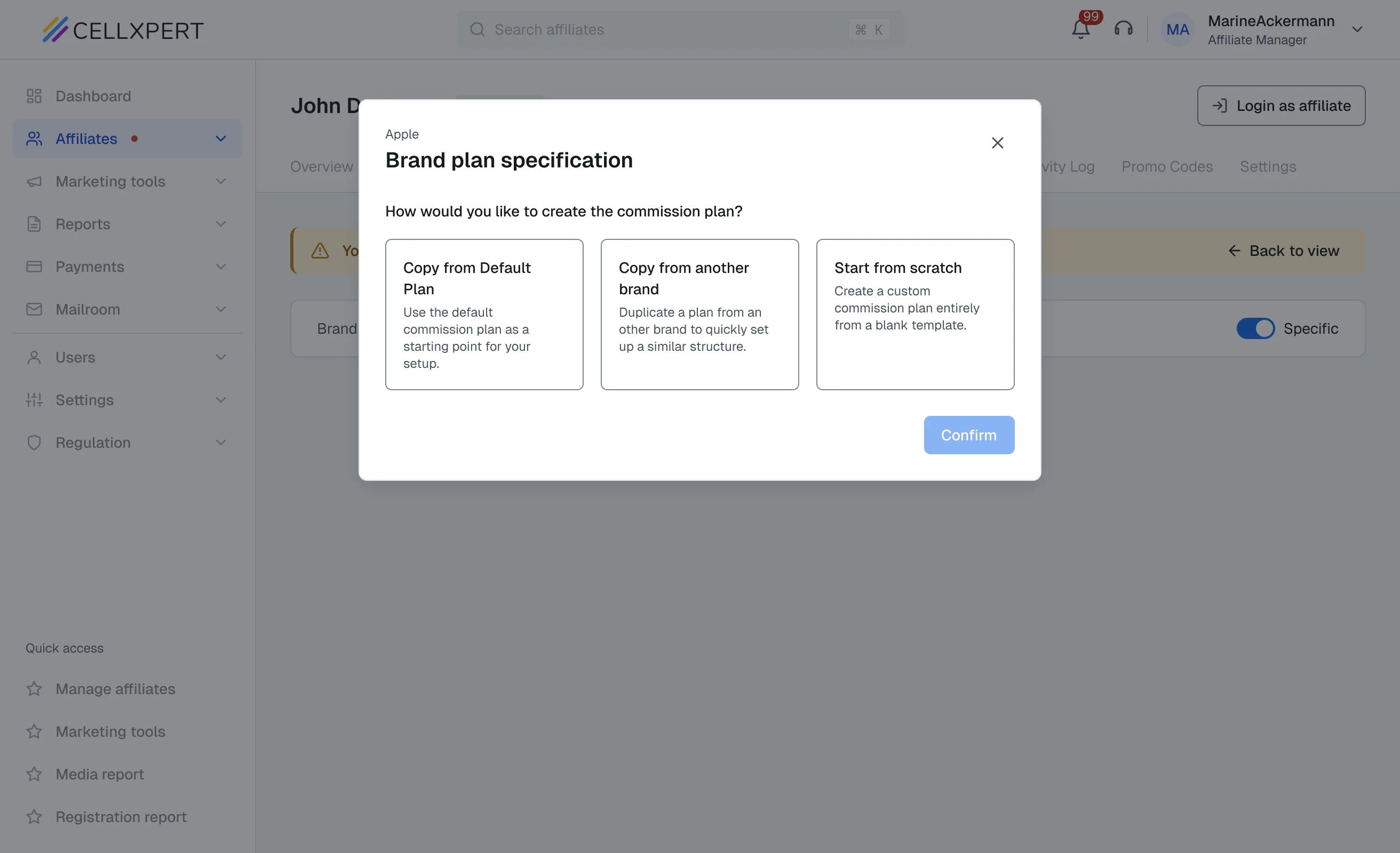
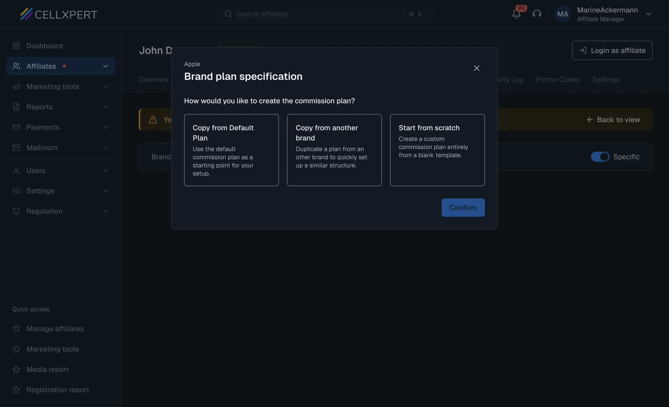
One modal, three pathsCopy the default, copy another brand, or start from scratch. Pick scratch.
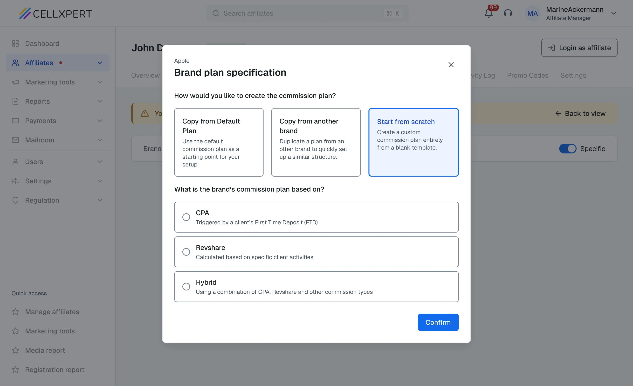
Choose the plan modelCPA, Revshare or Hybrid. Hybrid opens every plan type. Confirm to continue.
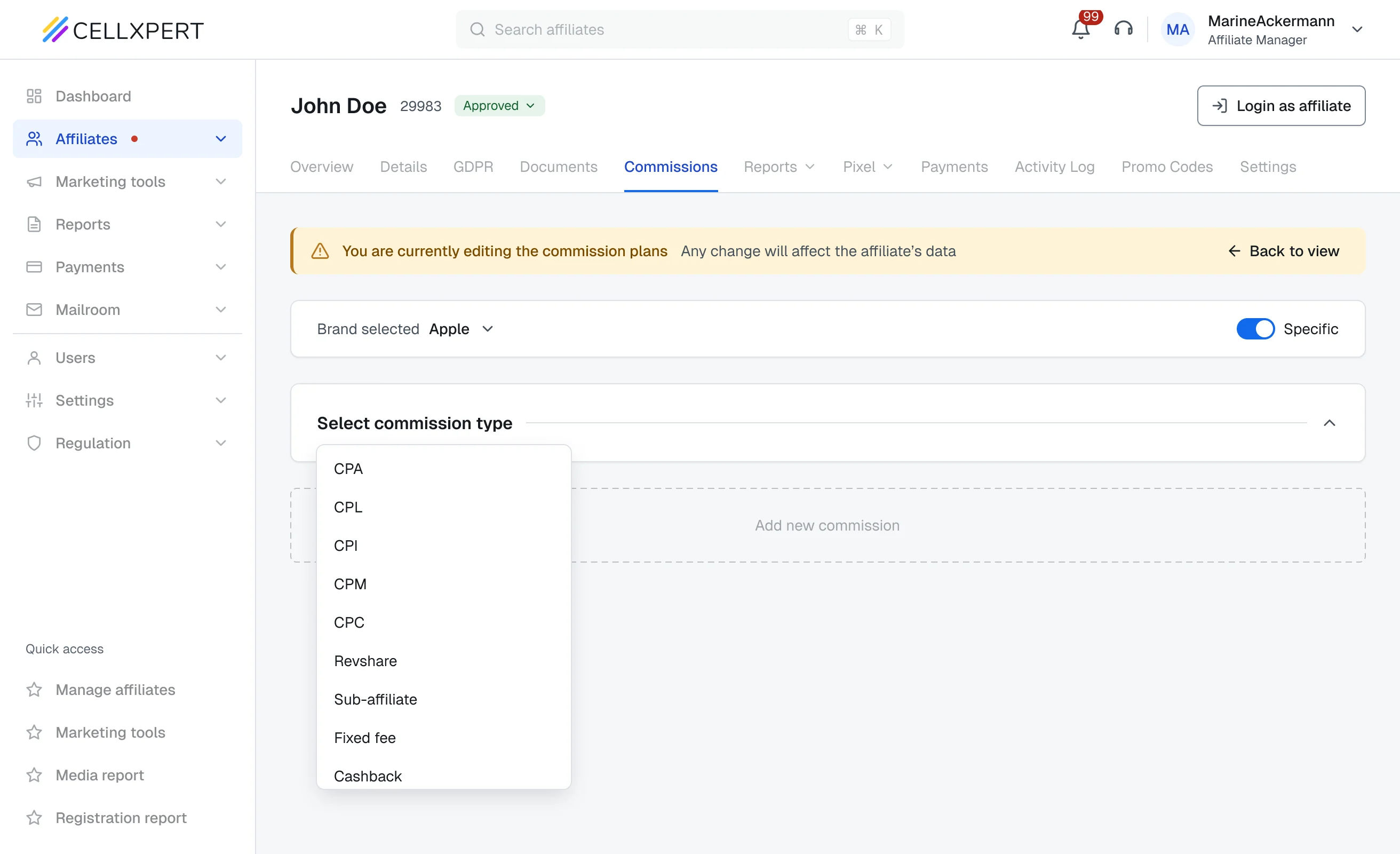
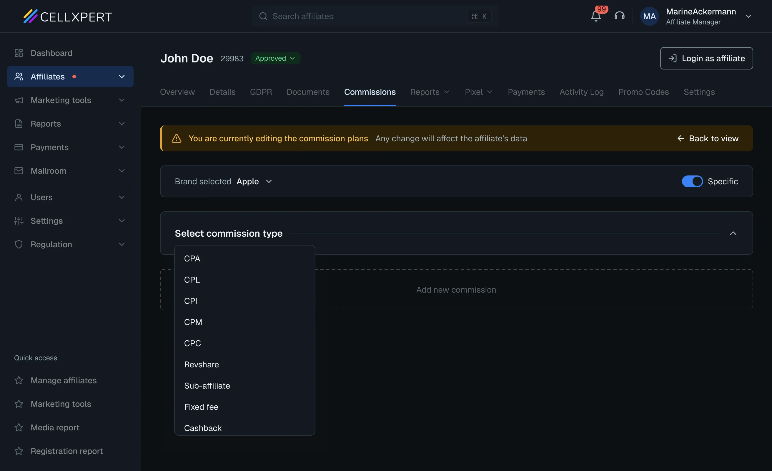
Pick a commission typeOver 40 plan types live behind this list. Choose any to add it.
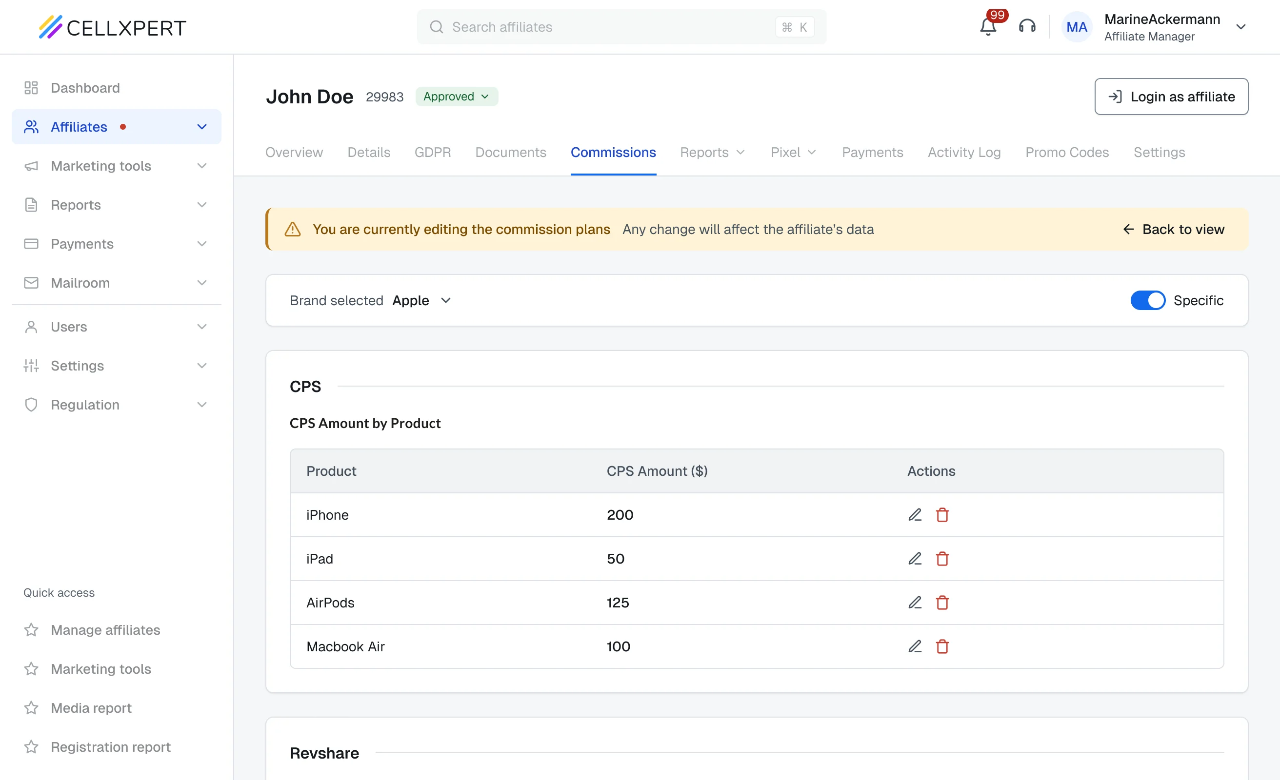
Fill in the detailsEach type brings its own fields. Here, CPS is priced per product. Head back to view mode when done.
Plan createdApple now has its own plan next to the default, with every commission in one view.
1 / 6
Validation
Tested with the people who use it daily.
Pre-release. These are validation findings, not post-launch results.
3 Tasks
01Understand a plan
02Change it
03Set up a new one
~12
Support reps and account managers
~25
Power users from clients
What I learned
Admins understood the full commission plan structure immediately, without guidance
In testing, users navigated the accordion and table structure without instruction. The reading experience was described as “finally clear.”
User testing, view mode sessions
Zero confusion about which mode they were in
Every tester understood the view/config distinction from the first session. The mode shift (disabled context, warning banner) communicated the change without explanation.
Internal QA & user sessions
Setting up a new plan started from the default
Setting up a plan also went well. Most testers copied the default plan and then modified it, instead of building one from scratch.
User testing, task 3: set up a new plan
The commissions redesign didn’t solve a visual problem. It solved a confidence problem, and that turned out to be the same thing as solving the business problem.
Next project
Cellxpert
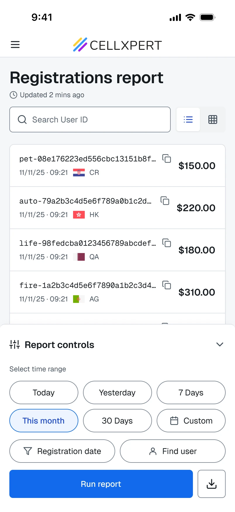
Registration report
Rebuilt the most-used mobile report. Rage clicks down 72%, related tickets down 55%.